If you’ve been considering a bathroom remodel - planning is key. Here are 4 Quick Tips to Expand Storage in Your Bathroom.
Making a Big Statement With a Small Space
You’ve probably seen them while visiting a friend’s home or scrolling through social media… little rooms with a BIG impact! Whether it’s a laundry room or a powder bath, small rooms provide an opportunity to do something daring and bold that you may be afraid to try in a larger space. Some rooms should have that special touch just for your personal enjoyment, while others are meant to show guests your style!
Everyone loves designing big dramatic spaces with limitless possibilities, but I’m not exaggerating when I say that our team loves designing and executing small, intimate spaces just as much. You know what they say about “good things and small packages”!
Which small spaces provide great opportunities for big design?
Powder rooms
Closets/Dressing Areas
Laundry Rooms
Butler’s Pantries
Reading Nooks
Small Studies
LED edge lighting around the mirror, large modern artwork, and a floating vanity add visual impact to this Afton Oaks powder room. -Interior Design by StudioMET, Photo by Curtis Lawson
Here are five design tips for maximizing the impact of your small spaces:
High-Impact Wallcoverings
Experiment with an unexpected texture on the walls created by handmade tiles. Wallpaper comes in thousands of patterns, ranging from classic to whimsical. Plaster finishes bring a level of sophistication. Dark, brooding paint colors can really set the mood for a dramatic effect.
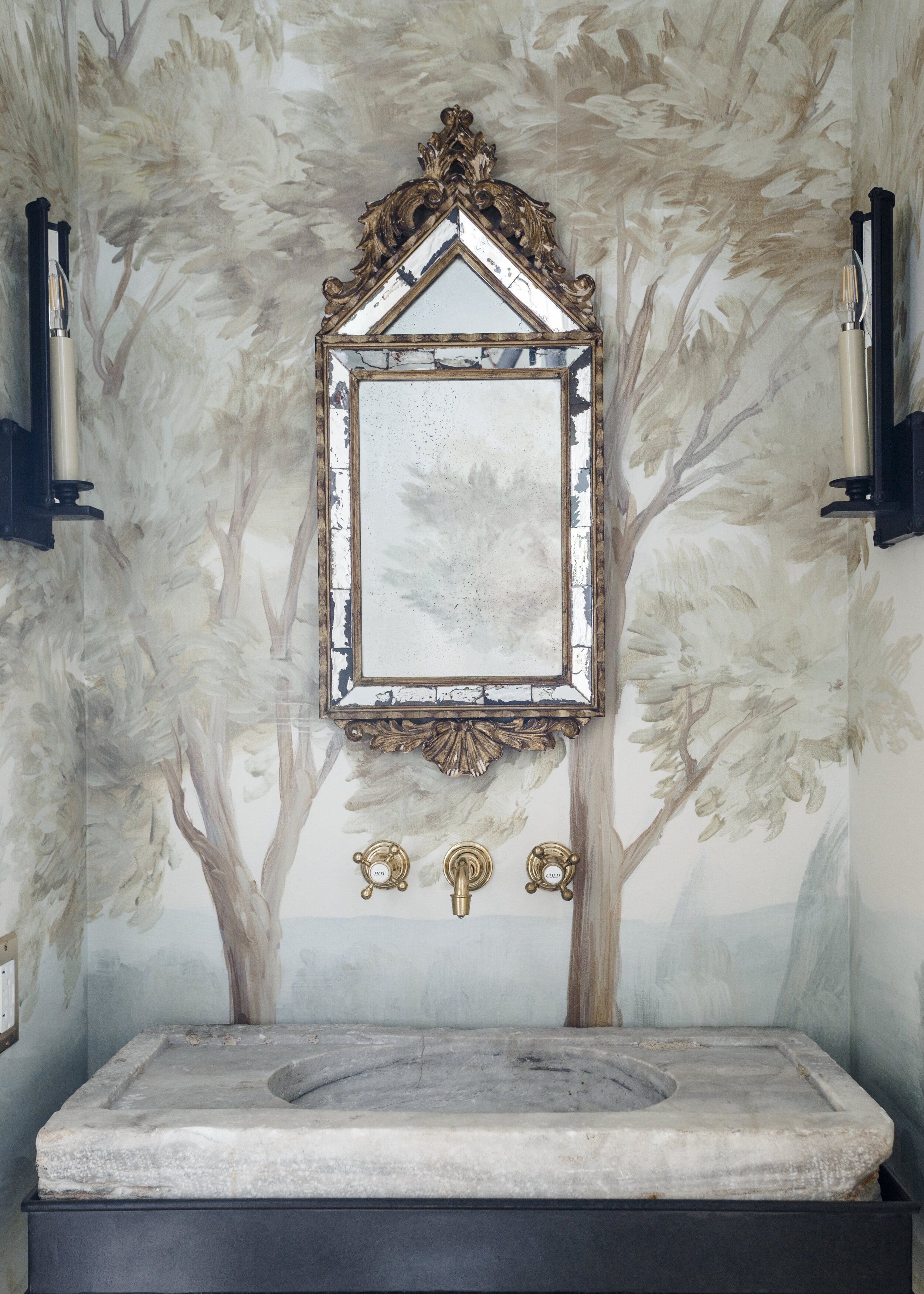
Hand-painted wallpaper, a wall mounted faucet, and 17th century stone washbasin from France provide high impact to this Memorial Villages powder bath. -Photo courtesy of Lauren Haskett Design
Lighting as a Statement
Lighting doesn’t necessarily have to come from overhead. Wall sconces or hidden lighting behind a mirror provide a much softer, more flattering light. A small chandelier or pendant can sparkle in the natural light pouring in from a window. In the absence of natural light, consider embracing a moodier atmosphere with more subtle, dim lighting.
This Garden Oaks powder bath comes to life with turquoise wall tiles, handmade copper sink, and coordinating hardware! -Design by Crafted, photo by Curtis Lawson
Oversized Artwork and Accessories
Large pieces of art can bring big personality and energy to small rooms. Artwork can also balance out or bring contrast to bold wallpaper.
Stay Away From the Ordinary
Mix old and new by integrating antique furniture as a cabinet base, a slab of wood from the family farm as a countertop, or a 14th century stone basin for your sink! If you have a modern home, continue the “clean look” with a wall-mounted commode, sink, and faucet.
Don’t Forget The Top and Bottom!
The 5th and 6th walls in a room (ceiling and floor!) are often neglected. Intricate flooring brings personality to a small space. Consider patterned cement tiles, antique brick, wood flooring in a herringbone pattern, or vibrant tiles. Ceilings can be highlighted by wallpaper, wood moldings, or a splash of color.
This small butler pantry in a Friendswood custom home really pops with a deep blue color and mirrored backsplash tiles! Design by Brickmoon Interiors, photo by Curtis Lawson.
If you’re considering upgrading your small space (or building a big one!), give the design and construction experts at Crafted a call at (713) 664-7131, or visit us at www.craftedhome.com.
3 Spaces to Consider Updating This Fall
5 Remodeling Trends to Try Before Summer is Over
5 Remodeling Trends that are Becoming Popular this Summer
How to Create Your Dream Bathroom
10 Tips to Help You Get Ready for a Home Remodel
3 Questions to Ask Before Starting the Remodeling Process
Get Your Home a New Look This Spring
How to Use Unconventional Thinking to Update Your Home
What's your 2021 vision?
Let's Talk Dishwashers!
Today’s dishwashers are remarkably different than those of yesteryear! If you aren’t getting good performance, then the problem may be YOU!
Older dishwashers just blasted dishes with hot water at high pressure and strong detergents. They used a lot of water and energy. Today’s models are much more energy efficient and use enzyme based detergents instead of phosphate based ones. This means today’s machines work better than ever before while also using less energy and water but you have to load them properly and use the right detergent.
Tips for Better Dishwasher Performance:
1. Don’t Pre-Rinse
Scrape off solids but don’t rinse it completely clean… leave some goop! If the dishes go in too clean, the soil sensor might cut the cycle short. The more gunk you’ve got floating around in the wash water, the more likely the dishwasher will run a full cycle. Skipping the pre-rinse can also save you a lot of money on your water bill!
2. Select the Right Detergent
Be sure to use a detergent with enzymes. Enzymes break down food bits better.
3. Use a Rinse Aid
Rinse aids work together with enzyme based detergents to help dirt slide off dishes and prevent it from re-depositing. They also help soften the water.
4. Load it Properly
Start by reading your dishwasher manual for loading instructions. Aim the dirty surfaces down and in toward the wash arms, avoid nesting bowls and silverware to closely and try not block water jets.
5. Soften Your Water
Hard water can affect the cleaning power of your dishwasher. Many modern dishwashers have a special compartment to hold salt, which helps soften the water. Another solution is to get a whole home water softening system (which can be expensive). You can also use a rinse aid specifically designed for hard water.
6. Maintain Your Dishwasher
Clean the filter a few times per year. Once a month is better!
Run the dishwasher with an empty load every six months with a dishwasher cleaner
Islands for Small Kitchens
THANK YOU to all of our clients, friends, employees, and trade partners for a wonderful 2020! We’re excited to see what 2021 has in store for us and the fun projects and people that we’ll get to work with! The best is yet to come!
-------
Kitchen Islands For Smaller Kitchens
Kitchen islands are a home design trend that will continue into 2021! Homeowners love the look, convenience, and versatility of having multi-functional space in their kitchens.
Not every kitchen, however, lends itself to a massive island in the middle of the room. But that doesn’t mean you can’t include an island in your kitchen remodel. Here are a few options for enjoying the benefits of an island when you remodel - even if you have a smaller kitchen.
• A Small Butcher Block/Sink Combo: Consider an island that is essentially a compact butcher block (for chopping/cutting) with a built-in sink for washing veggies. It’s a great workspace that doesn’t take up much valuable floor space. And you can forget about cutting boards!
• Make it Mobile: Another option is to have a butcher block mounted on a rolling stand like the one you see here. You can store items below and move the island to where it's more convenient. And if your kitchen is narrow, you can make the island narrow to match.
• Make Your Island Table Height: Most kitchen islands are counter height, but a lot of families don’t like sitting at that height for meals. If you want to include an eating space in your kitchen you could have your remodeler build you a table with a quartz top. It can be a workspace when you want it and a beautiful kitchen table for dining.
How Has Your Kitchen Changed?
There’s little doubt that kitchens have changed dramatically over the years. With the increased time at home in 2020, many people are bringing items into their home that they previously hadn’t considered. Here are a couple of things that have become more popular in kitchens this year:
At-home espresso makers
No-touch faucets
Antimicrobial materials
What would you add to the list?
Have a wonderful December! Reach out anytime – we’re here to help!
Home Maintenance Checklist
Many people spend $3,000-$5,000 per year on weekly maid service to keep the inside of their home clean, yet never think about the exterior and mechanical maintenance until something goes wrong. Often when something goes wrong with exterior systems it causes major problems!
CRAFTED offers annual maintenance plans for far less than you probably spend on maid service and miscellaneous repairs! For those who want to do their own maintenance, here’s a handy checklist of what you should be doing every year.
Briargrove Park Second Story Addition
Architecture: Brickmoon Design
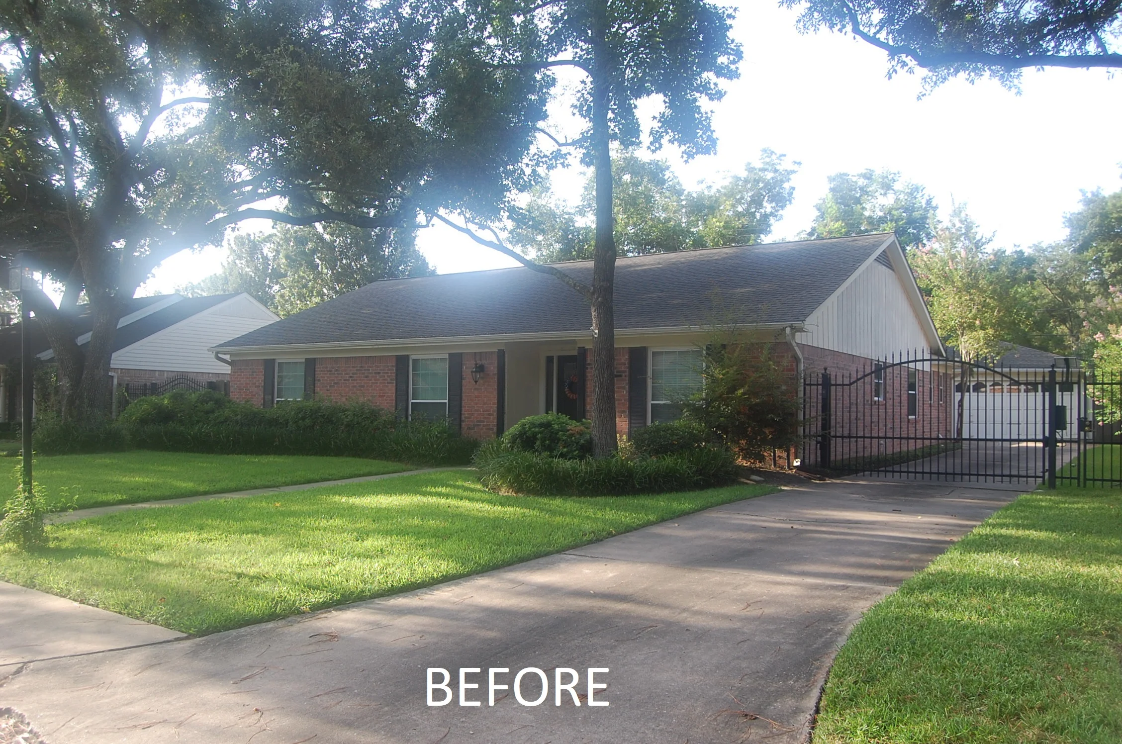
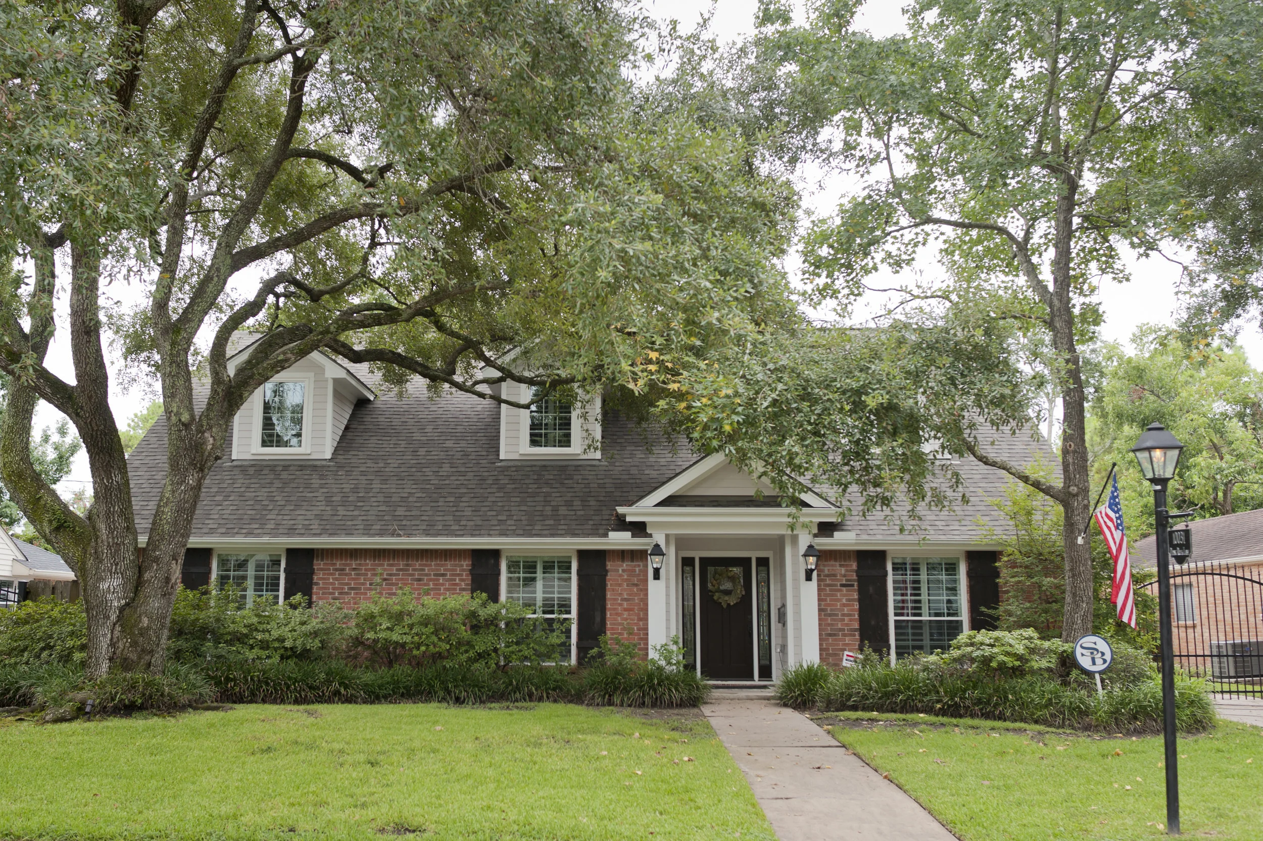
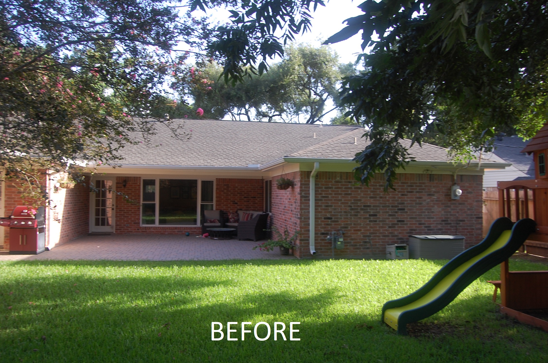
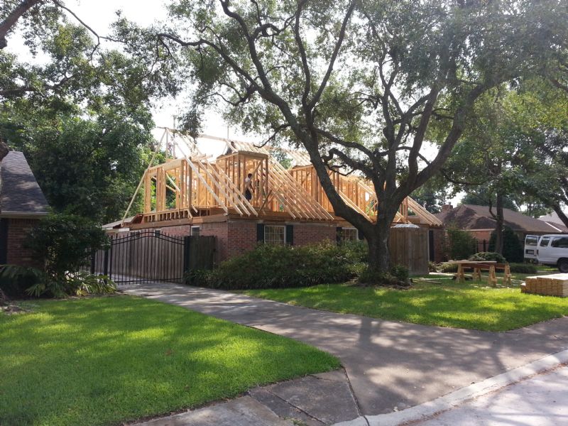
This young family living in west Houston’s Briargrove Park neighborhood was growing, and needed more bedroom and play space for their three children. The existing one story ranch style home was 2,008 square feet and contained three bedrooms and two and a half baths. Our architectural partners at Brickmoon Design created a fantastic second-story addition which would increase the overall size to 3,334 square feet providing four bedrooms PLUS a study, gameroom, and space for a future 5th bedroom. The new second floor also allowed us to create a fully covered rear porch for outdoor living.
The local wildlife (neighborhood watch?) was very interested in what was going on, and checked in on a daily basis!
One thing we have learned from doing second story additions that we tell all customers in advance: with our unpredictable weather you should automatically assume that the entire first floor is getting remodeled when adding a second! Fortunately for us, the only part of this home that was going to remain intact was the master suite, which was not getting covered by the addition.
When adding a second floor (or when building a new two story home) it is extremely helpful to frame using open web trusses instead of traditional 2x lumber or I-beams/joists. The webbing allows us to freely pass HVAC ducts, water pipes, drains, and electrical to whatever location is needed and not have to drill holes which weaken the framing members.
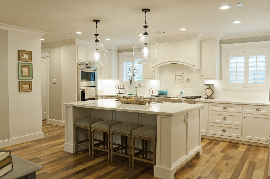
The floorplan was completely reconfigured on the first floor to create an open floorplan. The focal point of the kitchen is the large island which flows into the family room. The dining room is also open to the living space, and the dedicated study is just steps away.
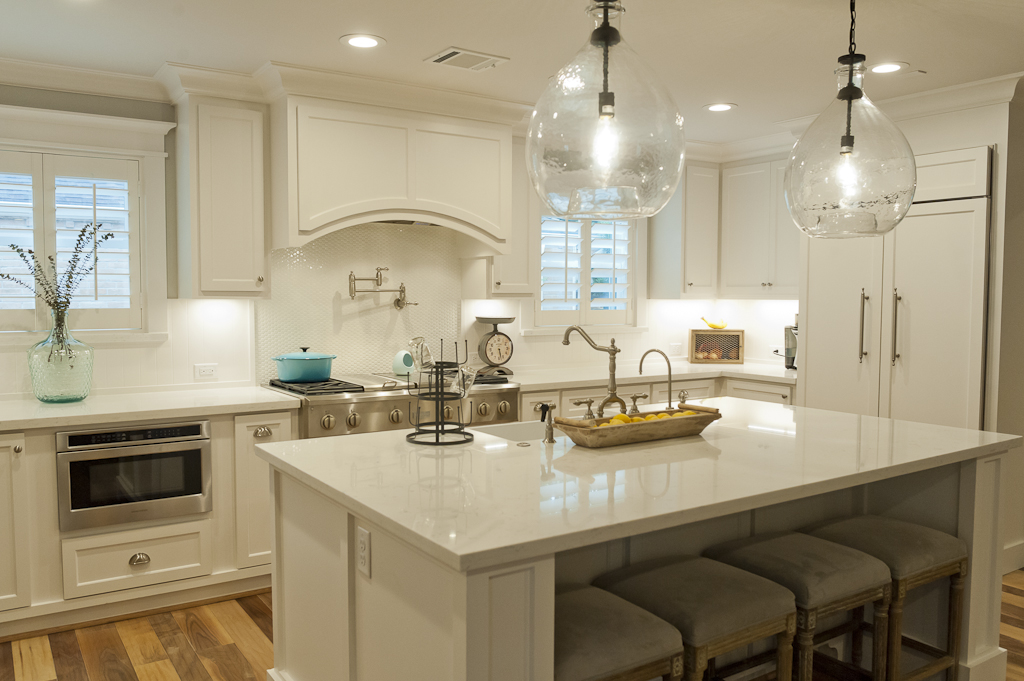
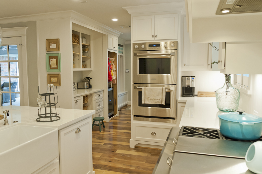
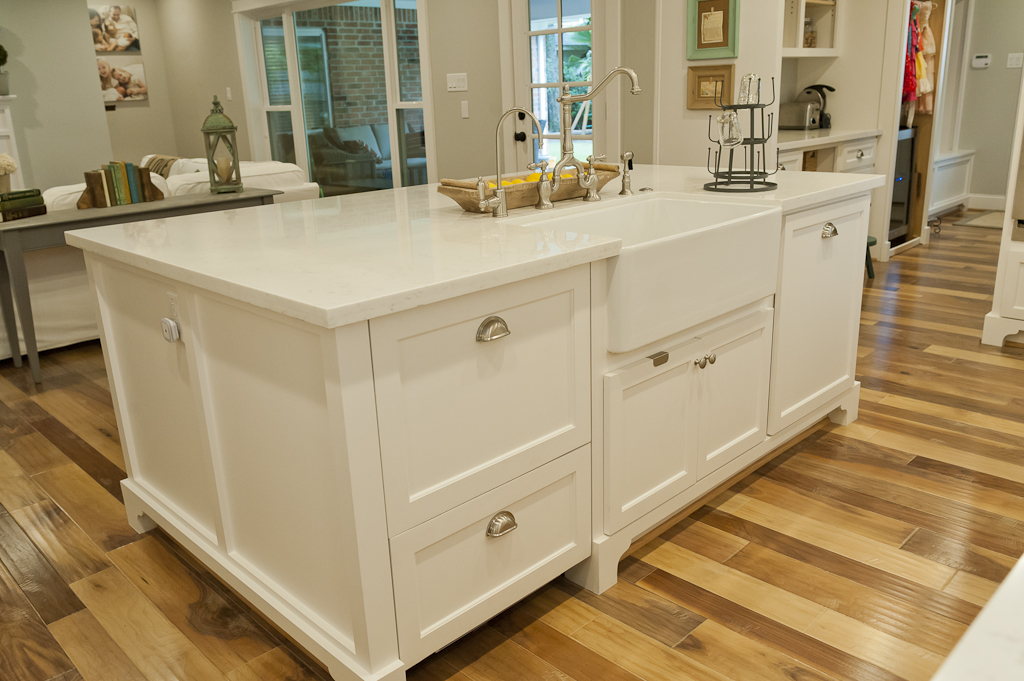
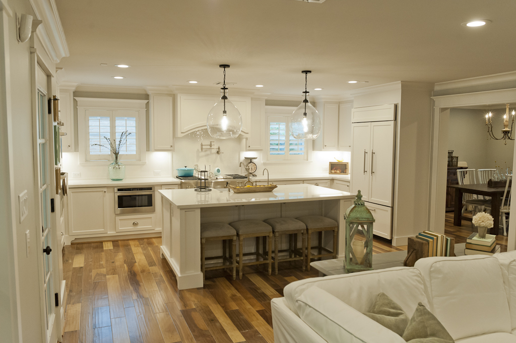
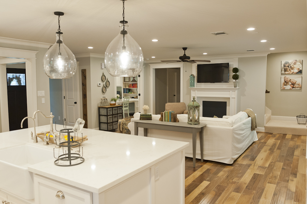
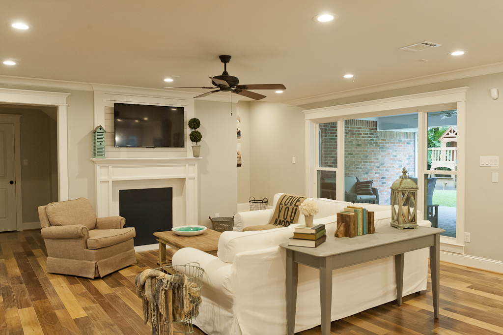
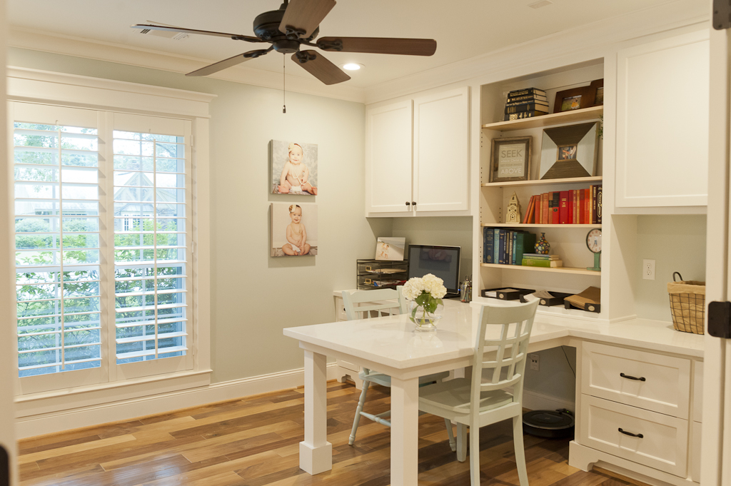
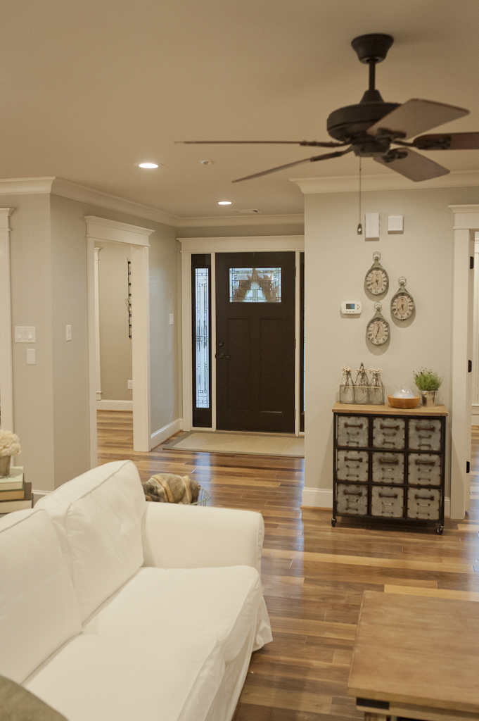
Upstairs, the spaces now include two bedrooms, two bathrooms, a gameroom, and a gameroom extension intended to be a future 5th bedrooom.
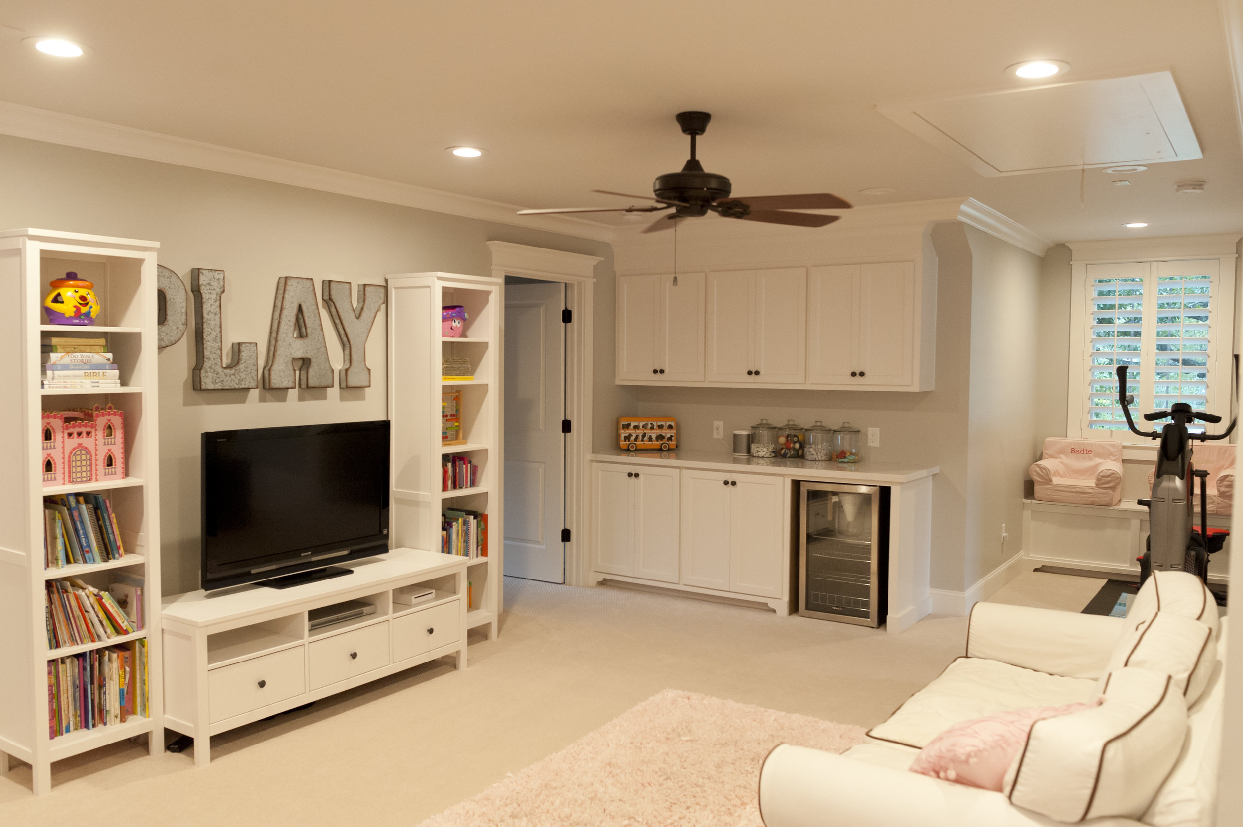
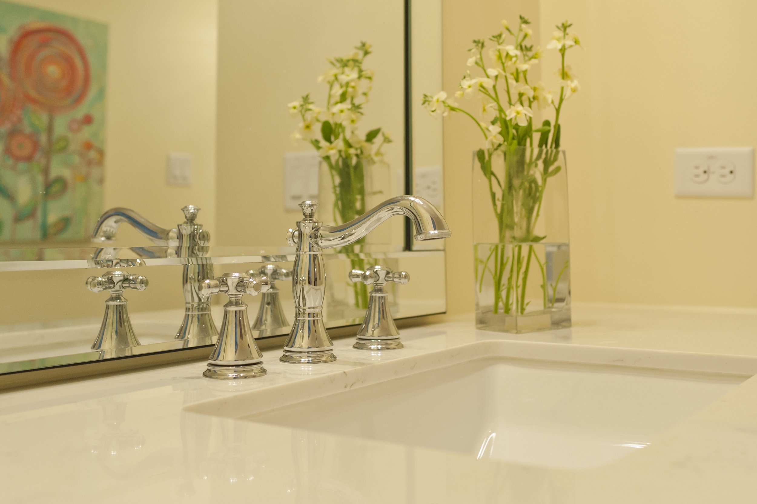
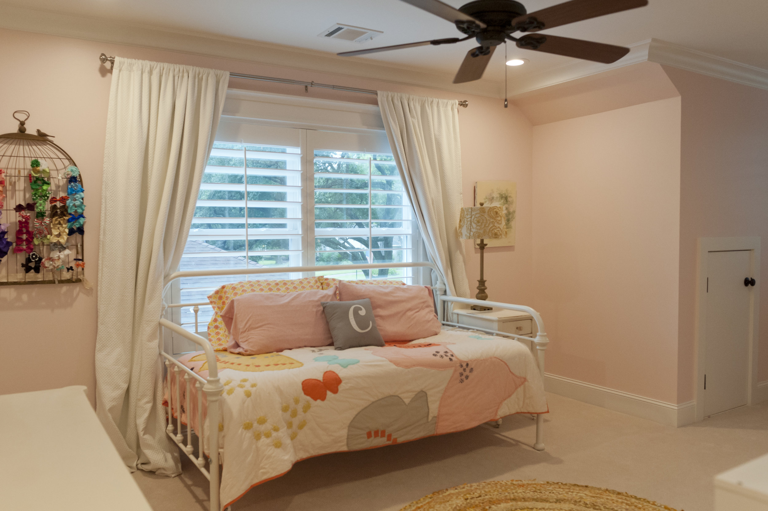
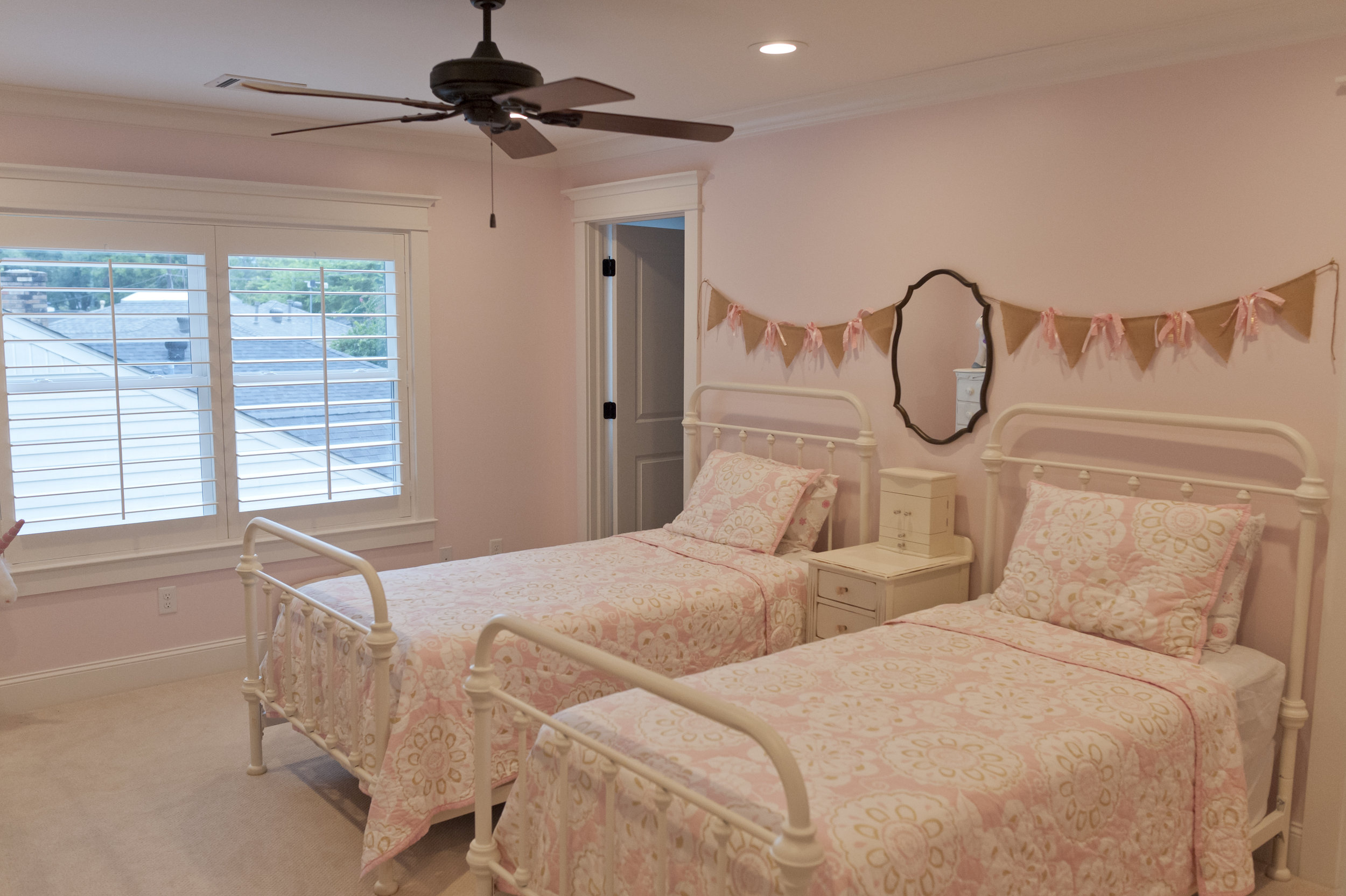
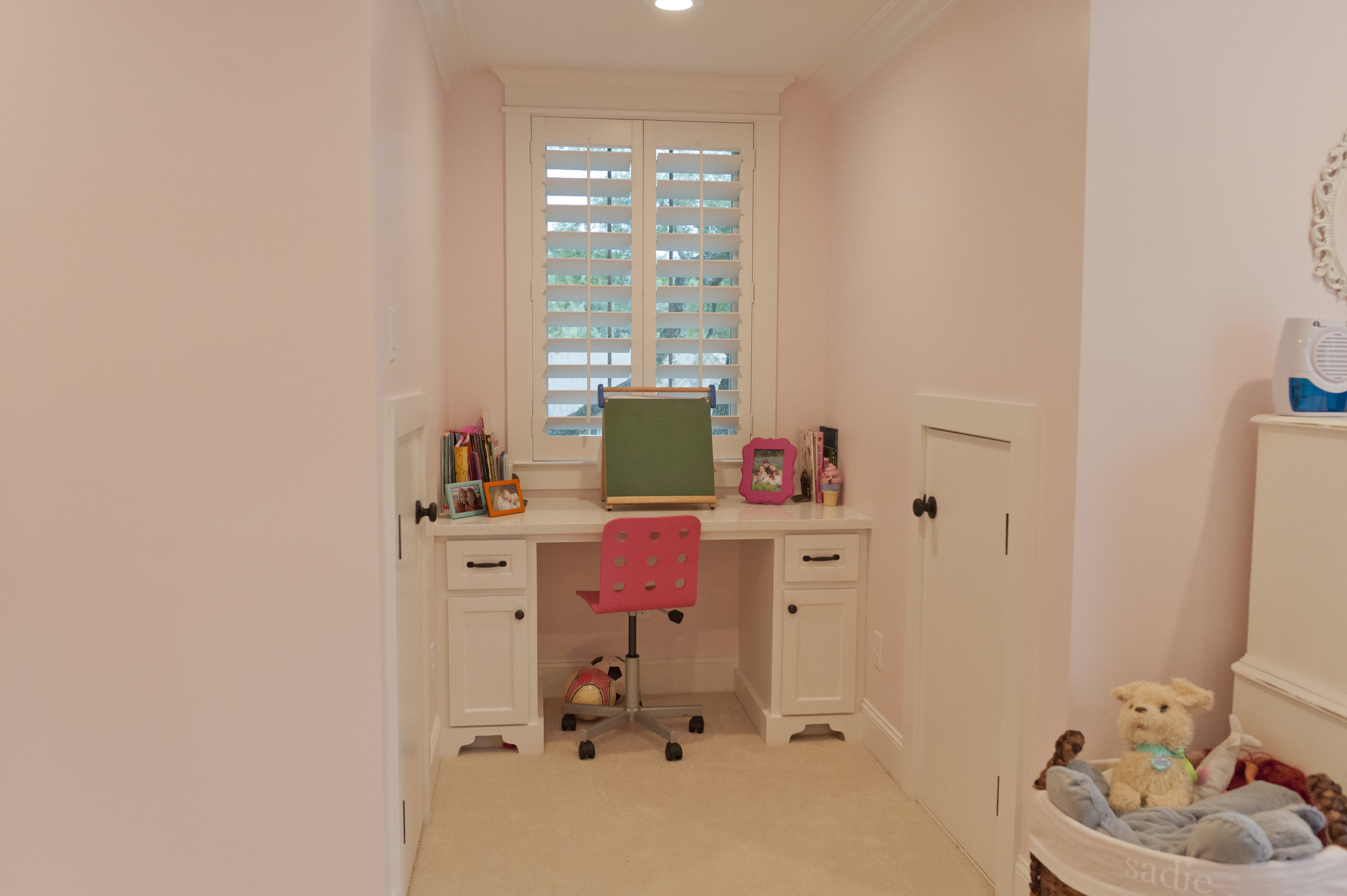
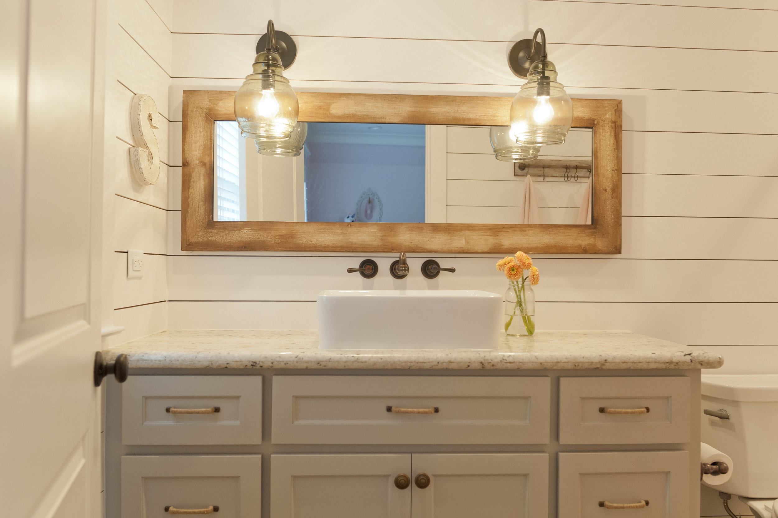
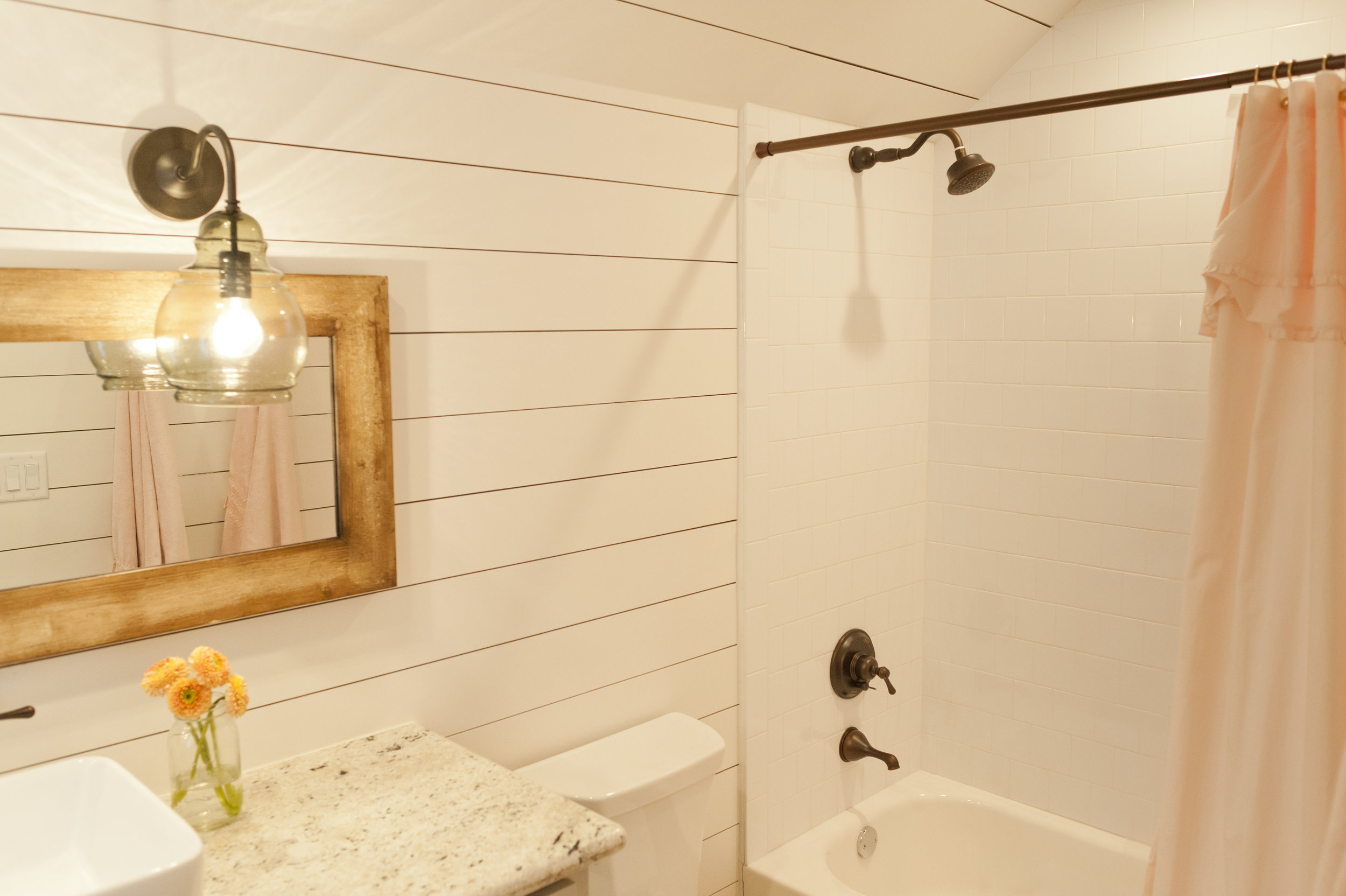
Our goal in doing these second story additions is to create a home that blends seamlessly into the surrounding neighborhood. We want it to seem the home was designed that way from the beginning, and not be an obvious addition. I think we achieved that, don’t you?
If you’re looking for a Design-Build contractor in Houston to do a project like this for your family, please contact the Crafted team!
Brookesmith Heights Modern Bungalow
Architecture and Interior Design: KinneyMorrow Architecture
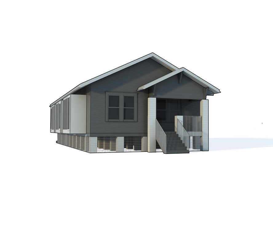
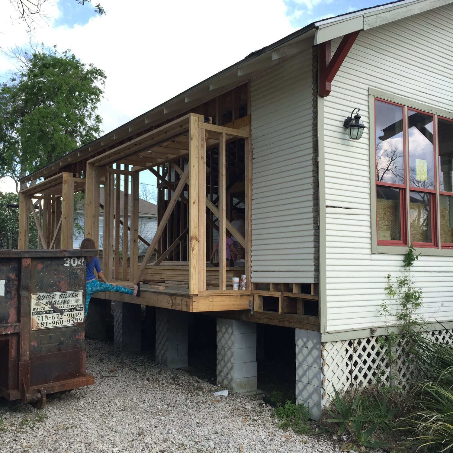
Our client wanted a compact yet livable home near downtown in this transitional Houston neighborhood consisting primary of 1920's bungalows. The original 842 square foot home was relocated to the existing site by a prior owner and contained only two bedrooms and one bathroom. The architect had a vision for a very modern styled home which still retained the charm and simplicity of the original "shotgun style" structure. A master suite addition and kitchen extension increase the square footage to 1,599.
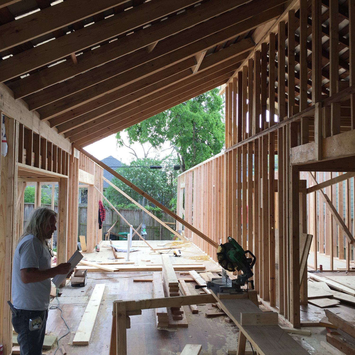
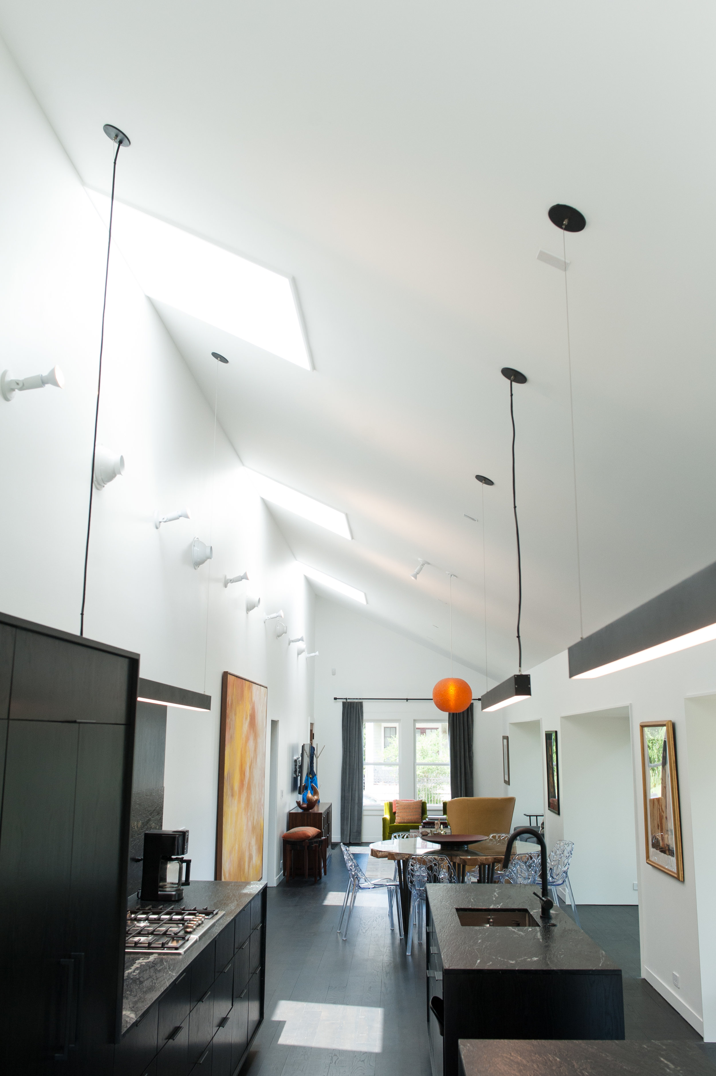
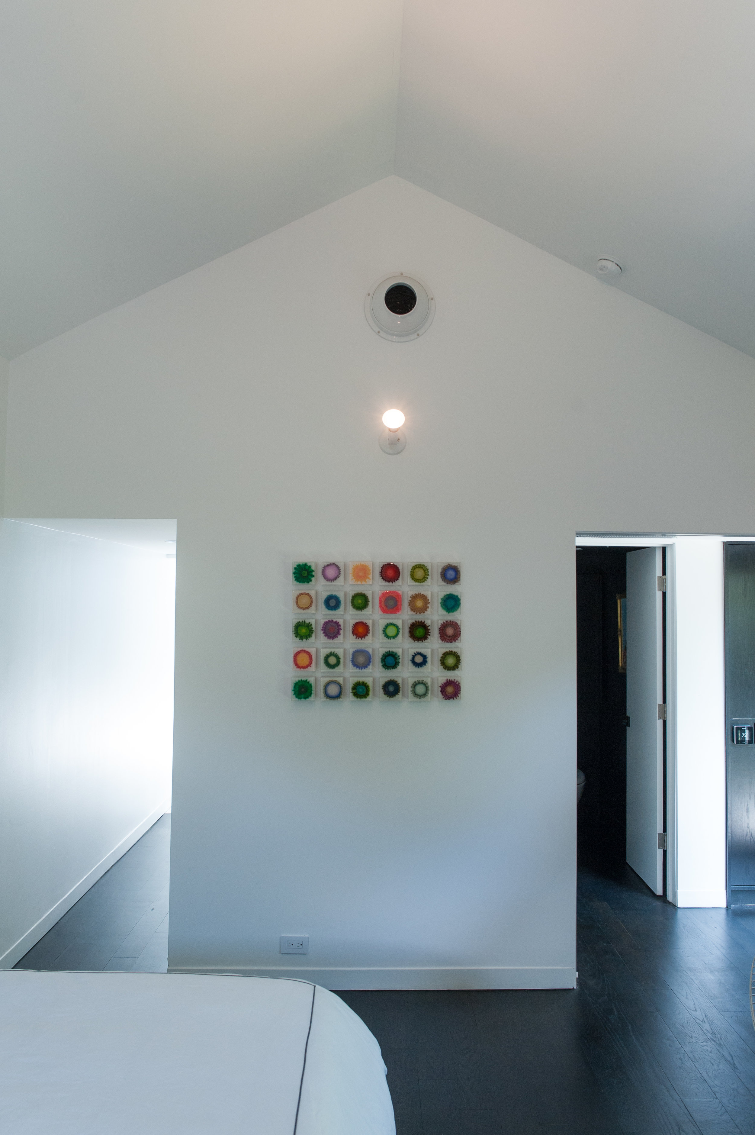
In order to pack so many features into a small footprint, several cantilevered areas were added: three to access a side deck off the living space, and one to allow the master bed to move outward for better flow around the bedroom. The ceilings of the living/dining/kitchen areas and master suite were vaulted to the roof’s ridge and skylights were added to create the feeling of space. Natural light flows through nearly every area of the home.
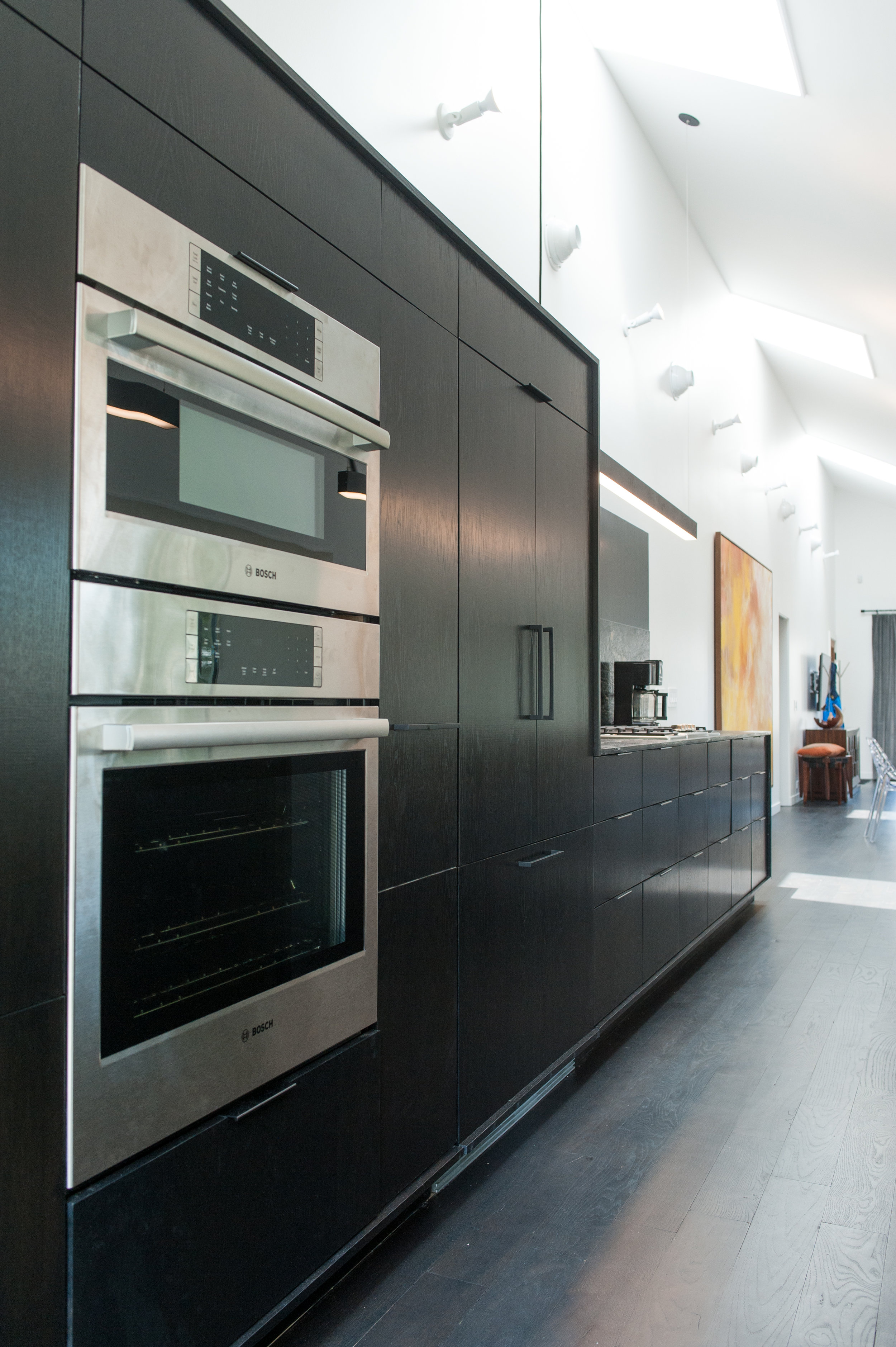
One of the biggest challenges for this home was creating a space for the mechanical systems. A tankless water heater was installed on the exterior to free up attic space. In our region we cannot place the HVAC equipment or ducts under the home, nor can we mount registers in the floors. The architect designed a mechanical platform over the master closet/laundry room which have dropped ceilings. This provided a central location for all equipment and short runs for the ductwork. Adjustable Seiko spot diffusers were used to direct airflow as required, and a thermostat was integrated into an electrical “dummy panel” on one side of the kitchen cabinetry.
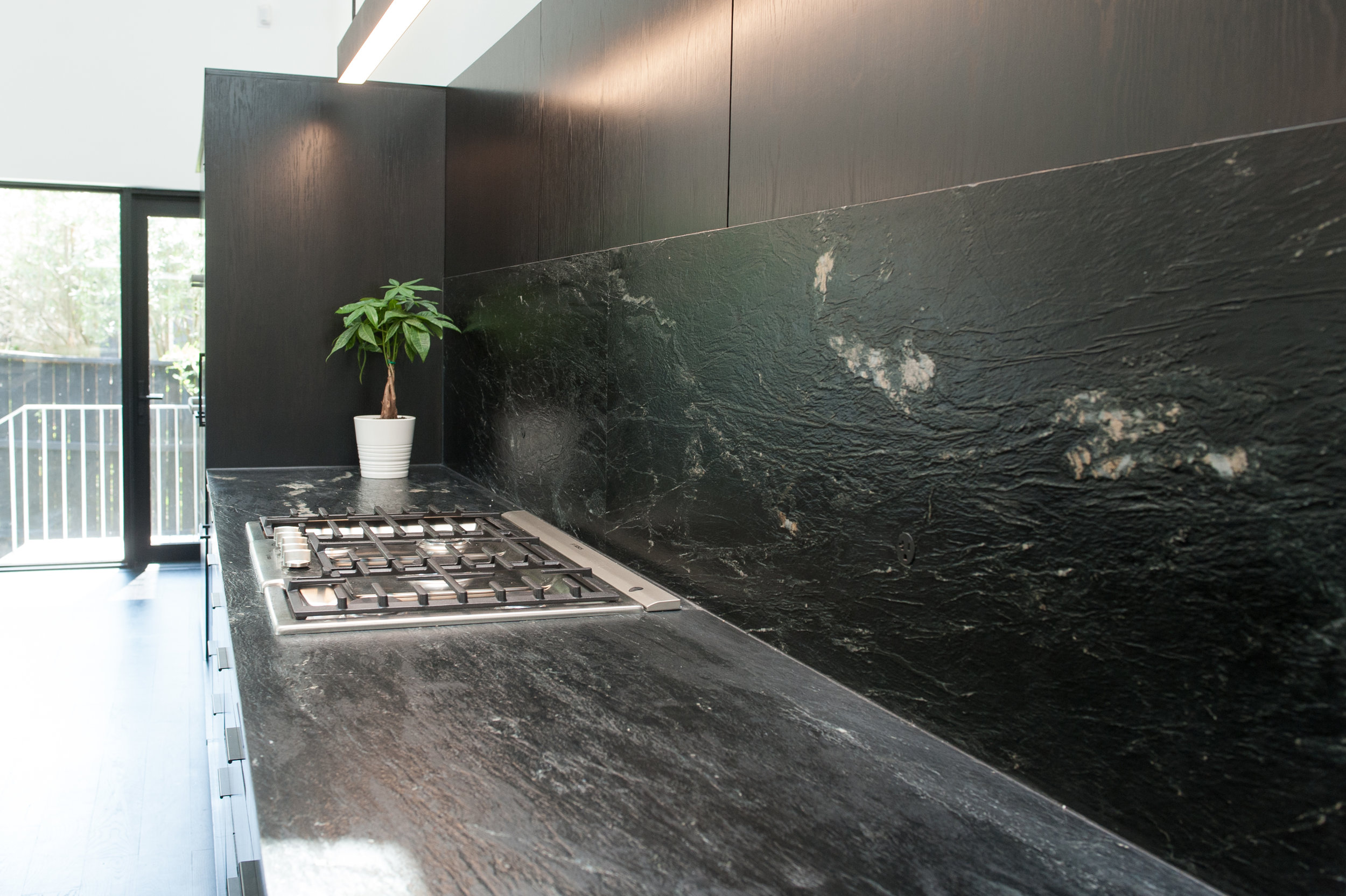
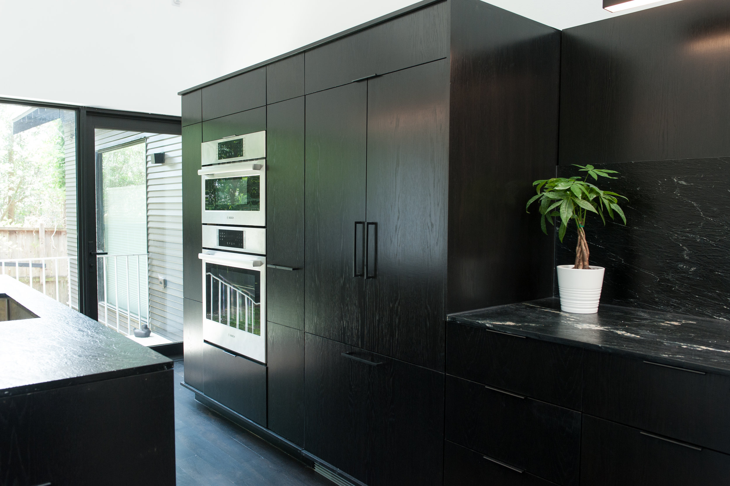
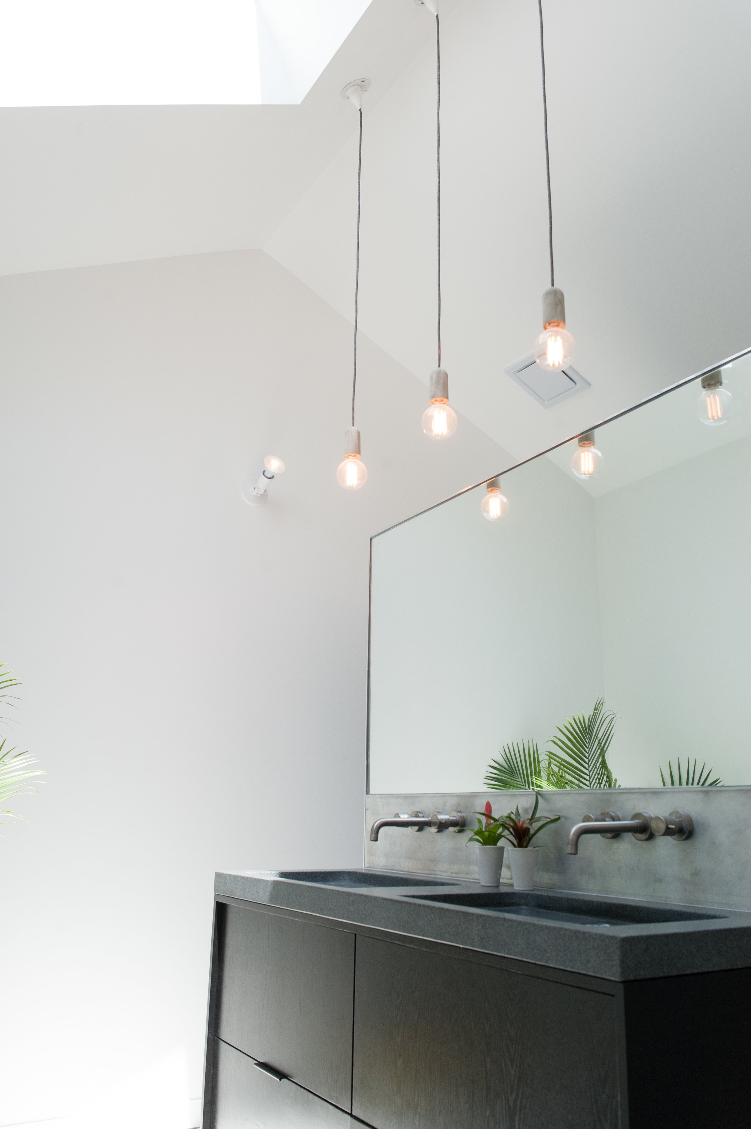
Minimal millwork was used; in fact there is no interior trim other than baseboards. Kerfed drywall returns were installed at the door jambs. Other modern touches include flush-paneled white oak cabinets stained a matte black, simple floodlight lamp holders for up-lighting, suspended LED task lighting, and flush-installed Bosch appliances. Switches and receptacles were integrated or concealed wherever possible. Bocci Series 22 receptacles are flush-mounted into the soapstone backsplash and are hardly noticeable.
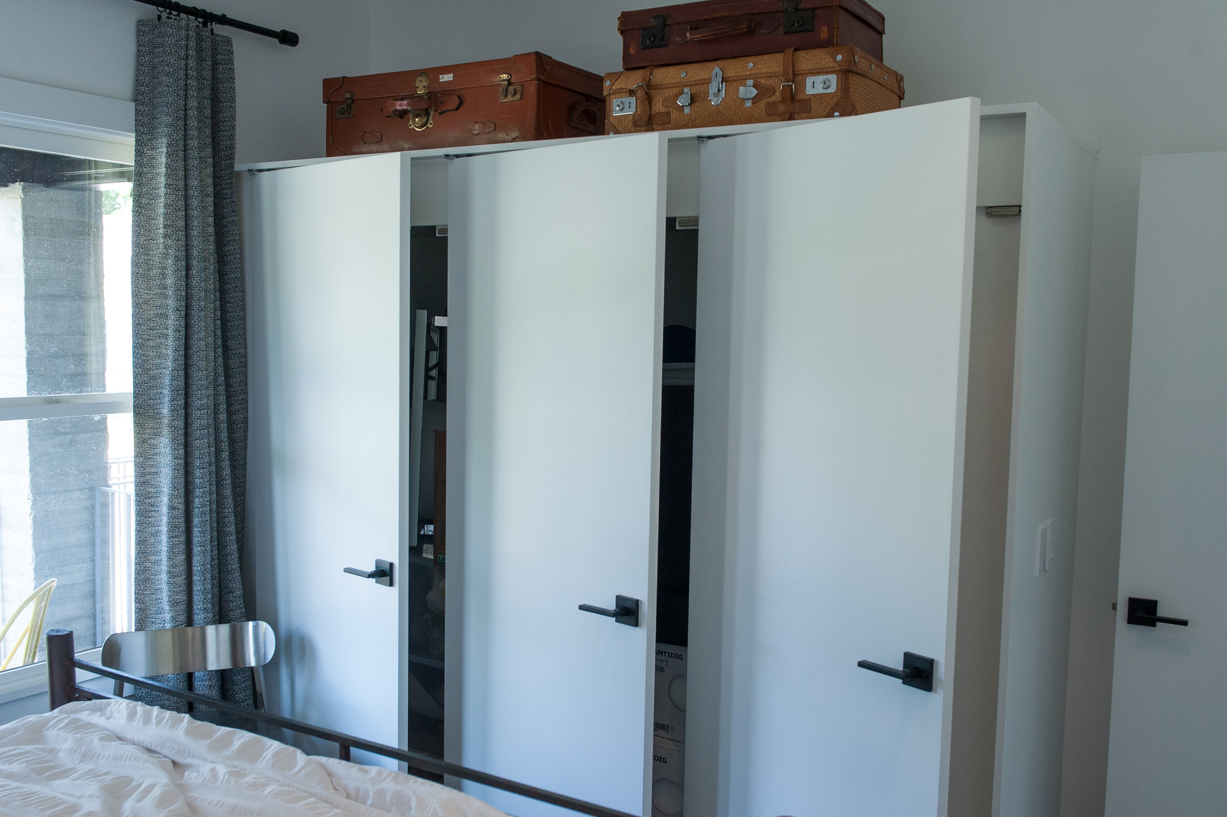
The original home had no storage to speak of, so closets were added to the front bedroom rooms. In order to maintain an open feeling, the closet walls do not extend to the 9.5 foot ceiling height. Instead they are framed to 7 feet, and pivot hinges are utilized to allow full access the space. This also provides an area for storage or display on top of the closets.
The original home only had one bathroom, so a powder bath was added near the kitchen and the existing bath was made to service the two guest rooms at the front of the home. The powder bath has a small footprint (only 3x6) but maximizes space with a wall-hung vanity sink and storage over the toilet. The hall bath has an alcove soaking tub, freestanding vanity, and linen cabinet.
An ensuite master bath was created as part of the addition, which is separated from the bedroom by the master closet/laundry room. The master bath has a floating vanity with stone countertop and integral sinks, and is separated from the shower area by a freestanding wall which is wrapped in brushed aluminum. The oversized shower is open (no glass enclosure) and slopes to a linear trench drain with tile inlay. The toilet area is tucked away for privacy while still maintaining the bathroom’s open feel.
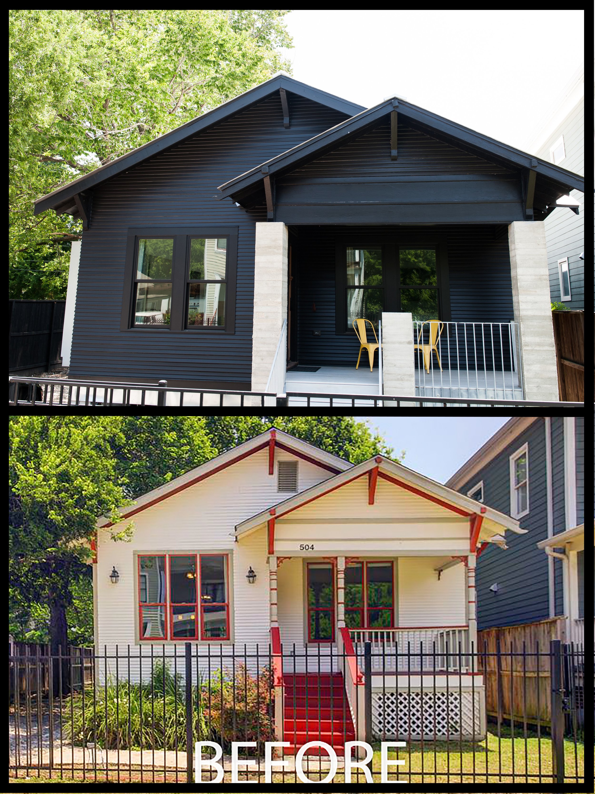
The bungalow’s exterior appearance was updated while still retaining the feel of the neighborhood. Original wood siding was retained, matched as needed, and painted a gloss black color. A standing-seam metal roof replaced the shingles and matching galvanized metal wraps the cantilevered extensions housing the Western door units. On the front porch, board-formed concrete columns with inset house numbers replace the original spindles and gingerbread details. A galvanized steel handrail was installed for the porch and stairs and the tongue-and-groove porch floor was stained an opaque grey.
This project is a great example of how you can maximize use of a small space and integrate many luxury features and finishes into a simple bungalow!


